
With the increasing number of people browsing on their mobile devices, it is important that your website adapts to these smaller screens. This makes sure your website’s content is still legible, navigable, and usable. Hence, this article will provide you with some insights into how to optimize your website for all devices.
If you are looking for ways to improve your mobile marketing, create a better user experience, or have people spend more time on-site, then you need to optimize your website for mobile devices. You will be doing yourself and your business a big favor by optimizing for mobile. Your site visitors are using their smartphones and tablet to surf the web 24/7. If they can’t find what they want on your site, they will find it elsewhere. Let’s explore several different ways you can optimize your website for mobile use.
Mobile devices are rapidly increasing in popularity and provide a wealth of useful opportunities for your company. If you are planning on Mobile app development service or launching a mobile version of your website. Then it is important to make sure you have done everything possible to optimize your site for mobile users and devices. This article will examine some popular trends in user browsing and help you identify. The important aspects of surfing from a mobile device and steps you can take to make sure your web content viewed in the best way possible. By people viewing it through their Android Smartphones or iPhones.
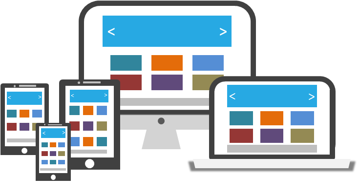
1. Consider a Responsive Website for Mobile Devices
Responsive websites designing to adjust the different screen sizes, and they’re great for mobile devices. When you’re designing a website for a mobile device, you want to make sure that it’s easy to use and that your site loads fast.
A responsive design helps with both of these issues by allowing the user to view the site even if they’re on their phone or tablet. This means that they don’t have to zoom in or out on their device in order to see everything clearly. Instead, the site will resize itself automatically based on what screen size it detects.
It also makes sure that all images are displayed correctly so that they look good on any device without distortion. Or pixelation happening during loading time (which can be particularly important for those who want access to high-quality images).

2. Use a Mobile-Friendly Theme
Your website should be mobile-friendly, or your business could lose out on a lot of potential customers.
According to a recent survey, about half of all internet users in the United States use mobile devices to browse online. That means that if your website isn’t optimized for mobile devices, you’re missing out on roughly half of your potential customer base!
Mobile-friendly websites are easy to navigate on small screens and can load quickly so that users don’t get frustrating waiting for pages to load. These sites also have text that is easy to read and makes good use of images and other multimedia content. They often include buttons that are big enough for users with fat fingers (or those who just have big hands).
3. Web Optimize Google Page Rank for Mobile Devices
If you are looking to optimize your Google PageRank for your mobile site, you’ve come to the right place.
The first step is to create an account with Google Webmaster Tools. Once you’ve done that, you can submit your site for review and begin seeing how it performs in search results.
Once you have your site reviewed, Google will provide a list of recommendations based on their analysis of your site. From there, it’s up to you to implement those changes and monitor how they affect your rankings in search results.
You can also optimize your mobile site by making sure it’s fast loading and easy to navigate on all devices (including desktops).

4. Streamline Your Content
If you want to streamline your content for your mobile site, we have Mobile application development services in Pakistan that can assist you. The first step is to ensure that your text is brief and to the point. This will allow people reading on their phones to read the information more quickly and easily.
The next step is to make sure that the images using to optimizing for mobile devices. The best way to do this is by making sure that they are smaller than 700 pixels wide.
The last step is to consider adding an icon or some kind of graphic that represents your company or brand so that people can easily recognize what they’re looking at when they see it on their phones.
5. Decrease Load Time
First, make sure that your images are optimized. This means they should be compressed and as small as possible without losing quality.
Second, use CSS instead of JavaScript for animations and other effects. This will make it so that the browser doesn’t have to download the entire page before it can begin rendering it, which will speed things up significantly.
Third, use asynchronous loading for any heavy-duty scripts or plugins (such as Google Analytics). This means that they won’t block the rendering of the rest of the page while they’re being downloaded and executed.
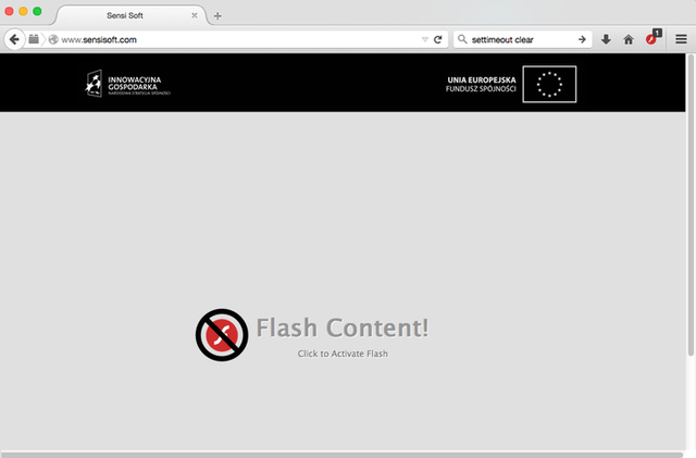
6. Avoid Flash and Java
To make your mobile site as fast as possible, we recommend avoiding Flash and Java.
These are two common ways to add interactivity to website, but they’re also very resource-intensive. If you have a large amount of content on your page, or if the user is accessing it on a slow connection (like 3G), then Flash and Java can slow things down significantly.
Instead of using Flash and Java, we recommend adding interactivity via JavaScript instead. It’s just as easy to implement and only requires one roundtrip to the server, which is much faster than the multiple roundtrips required by Flash or Java.